

Half the time, the answer you're looking for is in the figures.
The abstract tells you a treatment worked. But the table tells you by how much, in whom, and with how much spread. Until now, getting to that table meant opening the PDF, scrolling past the methods, and hoping the chart you needed was the one on page seven.
Starting today, Consensus brings those figures to you. When your question is about results, data, or statistics, the answer includes the charts and tables from the papers it cites, placed right next to the findings they back up. Click one and it takes you to the exact spot in the full paper.
Ask, see, check
Here's how it plays out in a search:
Ask about the data. Figures show up when your question calls for them: how big an effect was, how two groups compared, how a result changed over time. If you want them, say so. Adding "show figures from the papers" to your question makes them more likely to appear.
See the actual chart. What you get is the figure the authors published, with the axes, error bars, and sample sizes intact. We don't redraw it or summarize it. It sits under the finding it supports, with a link to the paper it came from.
Check the context. Click a figure and the paper opens to its full text, so the caption, methods, and discussion are right there. From there you can keep asking that paper questions: how was this measured, how long was follow-up, who got excluded.
[image: answer with an inline figure]
Two ways to use it
1. Compare results across studies
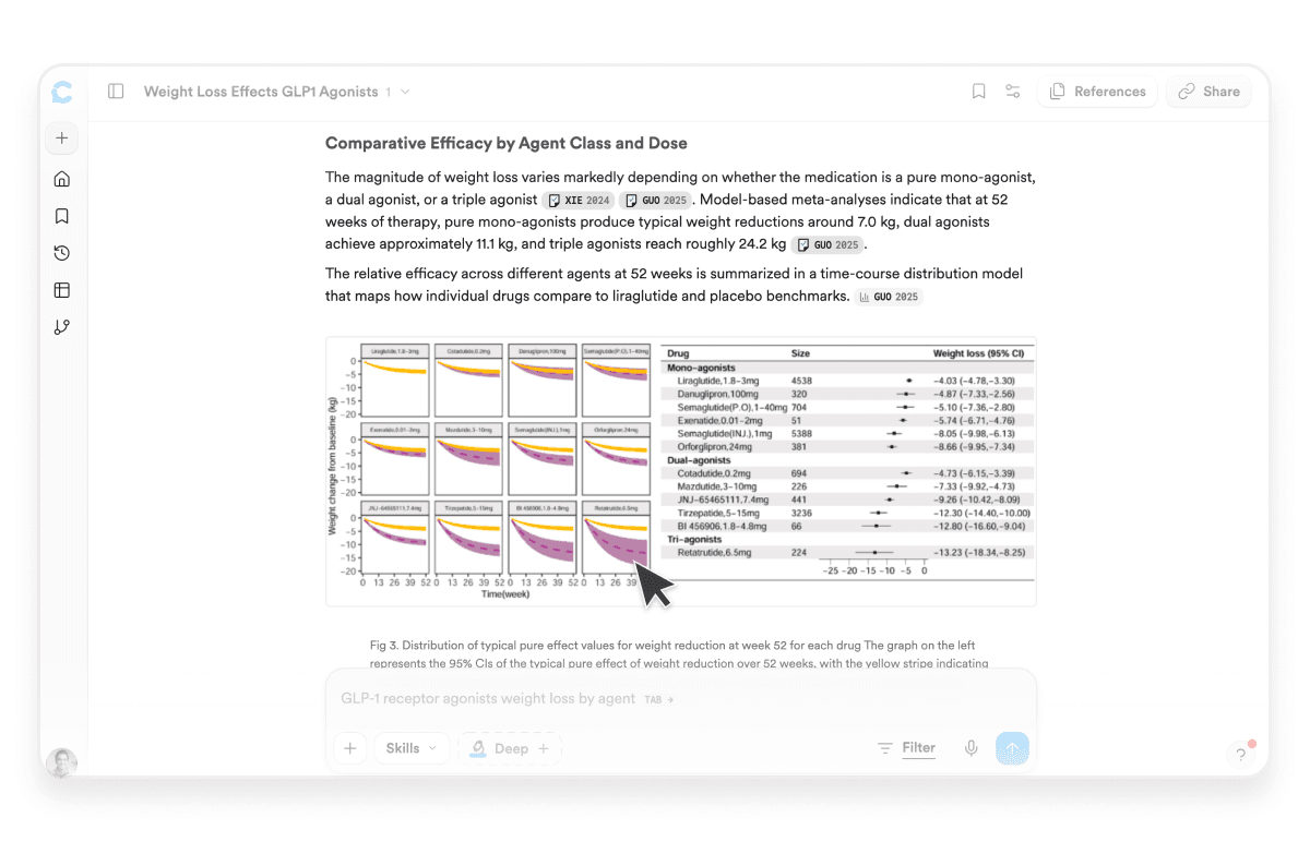
Say you're reading up on GLP-1 drugs and weight loss. Five papers report an effect, but "significant weight loss" can mean 5% or it can mean 20%. With the figures in your answer, you can look at the curves side by side, see which trials ran longer, and notice when one result sits well outside the others. That's usually what decides which papers you end up reading in full.
Try it → How much weight do people lose on GLP-1 receptor agonists? Show figures from the papers.
2. Find the number you need
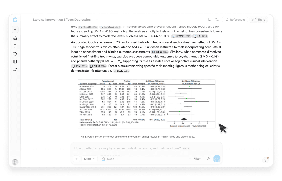
Planning a study usually means hunting for an effect size to base a power analysis on, or a baseline to compare your own results against. That number almost always lives in a table. Ask for it directly and Consensus pulls up the tables and plots where it's reported, so you can grab the value and cite the paper it came from without opening a dozen PDFs to find it.
What to expect
Figures come from open access papers for now, and we're working on bringing in more. Consensus reads each figure through its caption and description, so it's good at matching the right chart to the right finding, but it won't always answer detailed questions about what's plotted inside one. When you want to be sure, click through and look for yourself.
Search keeps getting better
Figures are one of the things we're shipping this fall to make searching in Consensus better, week by week. The Research Gaps Matrix went out on Monday, and there's more on the way. The goal hasn't changed: get you to the right paper faster, and show you enough of the evidence that you can tell it's the right one.
So ask a question about the data, look at the chart, click into the paper, and keep going.